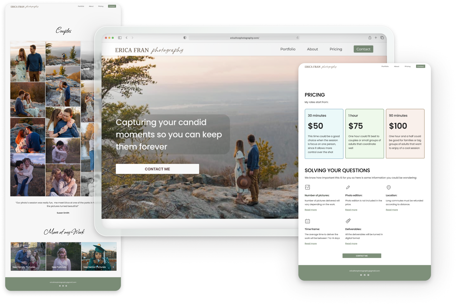
Erica Fran photography
Affordable Quality Image
Role: UX/UI focused on research and testing
Topics covered: Setting research Goals, Competitive Analysis, Interviewing users, Research Analysis, Persona creation, Information Architecture, Prototyping, Usability Testing
Project Overview
Erica Fran, a talented photographer in Nashville, TN, is looking for a professional and visually captivating website to display her photography portfolio. She needs a custom website design that aligns with her social media image.
Meeting with the Client
We established clear project goals and expectations, and we've committed to maintaining ongoing communication to exchange fresh ideas and obtain regular feedback.
Goals:
Have a more professional presence
Display her past work
Attract potential clients
The Research Journey
Planning our strategy
I meticulously designed a research plan with the purpose of uncovering the most effective strategies to meet our client's objectives.
Analizing Competition
I performed a quick Google search and noted two observations:
When searching for photographers in major U.S. cities like New York and Los Angeles, I observed that agencies and aggregators dominated the top search results.
When searching for photographers in Nashville, high-quality websites with user-friendly designs were scarce.
I discussed the collected observations with our client to gather her insights.
I conducted a S.W.O.T. evaluation to assess the performance of both direct and indirect competitors for our client. I chose:
Two local photographers who use their websites to get clients
A successful business that uses Facebook to find customers
A business that advertises through an intermediary website.
This gave me really important information that helped us tackle the design challenge.
Recruiting Interviewees
Even though photography is an up-and-growing business nowadays, finding volunteers who have hired professional photographers was not easy.
I recruited six people:
Three people with experience hiring, from whom I aimed to learn from their experience.
Three with no experience but from whom I wanted to learn by observing their actions.
Conducting Interviews
I wrote a script that included open-ended questions for each group. This way, I would not forget to ask for any information I had planned to collect in the Research Plan.
Analyzing Data
To organize the information, I made two documents:
1 - A workflow illustrating the steps taken by inexperienced volunteers when trying to find a photographer.
2 - An affinity map that shows what experienced volunteers recall when hiring a photographer.
What I learned from their Experience
About the search process:
When people search, they may not know precisely what they are looking for
Searching for photographers online is overwhelming
Searching on Instagram or Facebook makes it less painful
Having a website is associated with being expensive
What is important:
People trusted people they knew, and word of mouth
The price was, in all cases, the deal-breaker
The second most important was having a style, type of photos, or aesthetic they like and offering a good quality image.
Having a good reputation, being talented, having their equipment, or being in the same city were considered significant.
Being a very experienced photographer was not considered very important.
What I learned from their Actions
They would follow these steps:
1st - They would call a photographer's friend
2nd - They would ask their friends
3rd - 3 out of 5 would turn to social media
4th - 4 out of 5 typed general words in Google
From the people who searched online:
Two people focused their attention on the results on the map
They had access to work, ratings, and reviews
They visited the website to find the portfolio and price
Two people preferred agencies
They had a hard time finding work and a price
They all agreed that if they didn´t know any photographers personally, they would contact several photographers to compare services.
Finding a Question to Solve
I acquired a lot of information during the research phase, and now I had to be precise in defining the question that would help me solve my client’s problem. I explored different POV statements and transformed them into HMW questions until I found the right one
Our H.MW. question:
How might we make Erica´s brand high-quality and professional while being perceived as affordable so that she can attract new clients?
Creating Susan
I finally created Susan, a representation of our user type. Susan lives in Nashville. She just got engaged and dreams of having a photo session with her fiance to have a pleasant memory of this important moment. I had to think of her when answering our HMW question. She would accompany me throughout the rest of the project.
Solving the Question
I set out to brainstorm ideas but quickly realized that solving our HMW question of this nature would require more research. How can we transmit an image of affordability and good quality in the same product?
I devised some ideas and analyzed good quality brands to see how they sold their products.
I noticed that some brands with excellent user reviews in supermarkets used clear packaging to convey that they were the cheapest option.
Other practices were making plain designs or taking lower-quality photos, but obviously, those were not solutions for our product.
Focusing on digital brands, I observed that certain products, including the ones related to image and aesthetics, did not reduce design quality.
It was more common to include offers, slogans, or reviews to convey to customers that they were cheaper but not of worse quality.
Determination
To make Erica´s brand high-quality and professional while being perceived as affordable, we should not reduce the quality of its look. The image of her product must maintain high standards to preserve her professional reputation. As they demonstrated during our interviews, clients’ expectations in photography are very high, and we need to show that we live up to them. We will consider clients’ pain points in the design and focus on simplicity, transparency, and good UX.
Getting in the Mood
Erica´s Colors
To make the color palette, I used the concepts that, during our first meeting, the client told me he wanted to convey, and I took the most characteristic tones from Erica's work. The result was an excellent combination.
Typeface
Betting on the clarity of reading on a digital screen, we shortlisted some well-known sans sheriff. Still, we finally chose Poppins for its modern and clean appearance.
Since part of Erica's logo looks handwritten, we decided to accompany the main font Poppins with the script font Allison. Despite its low readability, it will give the page an artistic and rustic touch.
Finally, we put all the previous work on a single page to serve as a mood board.
Low-Fi Exploration
Having a general idea of what we needed to achieve, I explored the first design options.
Mapping the User Journey
The sitemap was very straight forward. It had to be simple but still display prices and style and introduce the artist.
During the research phase, I learned what our interviewees needed to know before considering hiring a photographer. We also discovered that they searched each piece of information in a particular order. That order will be the one that will define the task flow.
Starting from the sitemap I defined the user flow thinking about how the user would flow from the home page to the goal of Erica´s webiste, getting in contact with her.
Ready to Test
With this usability test, we wanted to check the efficiency of the design and the ease of navigation and see if we aroused the curiosity of the volunteers and they flowed as naturally as possible. That is why we present a prototype that is as realistic as possible, taking care of the colors, photographs, and text, simulating something very close to what we expected the final product to be.
Time to Test!
I developed a plan that delineated the steps for conducting our usability test and managed to secure the involvement of five volunteers.
I also created a list of questions along with a script to ensure I didn't miss anything important when we talked to them.
Usability Test
The test was a great success. All the volunteers achieved the tasks.
Iterations
Listening to the impressions of the volunteers, three iterations were carried out.
First Iteration:
After the third test, the navigation proved easy, but we discovered we needed to provide more and better information.
I added a contact label in the header
I designed a new page to see amplified pictures in detail
Transformed bullet points with prices into pricing cards
Included more information on the pricing page
Described services better and moved them to the landing page
Second Iteration:
We had completed all five tests, and the fourth and fifth volunteers had no say about the amount of information provided.
I added new icons to the “Solving your questions” section. We elaborated a set of icons for the “Services” section that adapted to the brand’s look.
I changed little pieces of information to the requirement of the client
Third Iteration:
This iteration was made after the in deep last review of the design
I fixed minor details such as punctuation incoherencies and little color variations to round off the work.
The Before and the After:
Before:
After:
More transparency
More professional look
Before:
After:
Information is less confusing, more readable, and easier to understand
More professional look
Before:
After:
More detailed information
More professional look, but the prices still look affordable
OUR FINAL PRODUCT
Measuring Success
Did we solve the problem?
The original statement was:
How might we make Erica´s brand high-quality and professional while being perceived as affordable so that she can attract new clients?
We have designed a straightforward and uncomplicated website that's easy to navigate, with all the features users and the owner might need. The information is clear and transparent, and the user experience inspires confidence and professionalism.
Final Thoughts
-
Designing a mobile version
In the future, we could add a password-controlled section that could work as a personal space for consumers to facilitate communication with the company and speed up access to delivered work.
-
Transmitting the feeling of affordability does not mean reducing the quality of the user experience. If a product is confusing, it will lose the user's confidence and, at the same time, sales.
Providing the correct information on a website could save a lot of work for a company, but excess data will increase the bounce rate.
Users of different generations search online very differently, and social media is taking away protagonism from online searchers.


